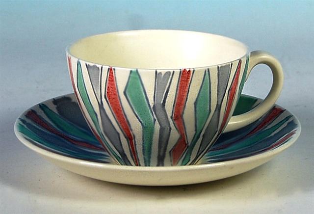
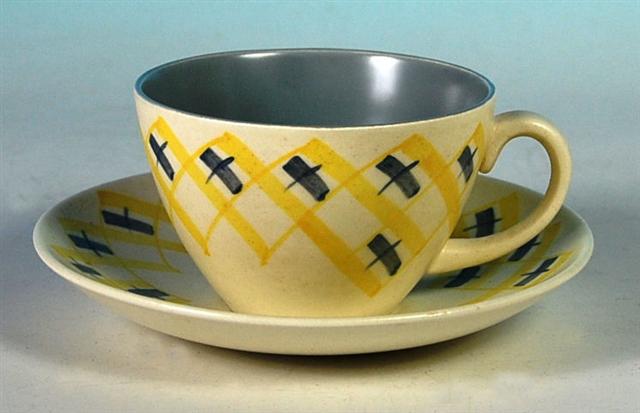
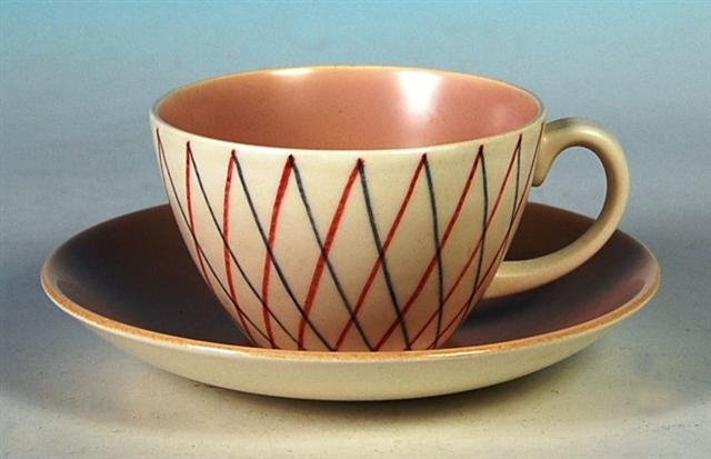
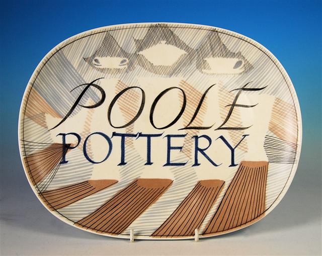
The 1950s
The Pottery operated with only a skeleton staff during the Second World War, mostly producing undecorated utility ware in line with government restrictions. Many of the trained staff did not return at the conclusion of hostilities. The showrooms had been taken over as a customs office by Imperial Airways, whose flying boat service to America and the outer reaches of the Empire had been moved from Southampton to Poole Harbour by the Air Ministry.
During the War the old kilns used for the manufacture of structural ceramics by Carters had served as air raid shelters and the Pottery was effectively derelict [the Poole Potteries by Jennifer Hawkins, 1980].
Above - picture taken prior to the redevelopment which took place 1946-49.
The period 1945-50 was one of re-grouping and reconstruction. Harold Stabler died in 1945. Truda Carter had reached retirement age and John Adams suffered ill health. Roy Holland (who came from the Potteries in Stoke on Trent) was appointed works manager in 1945 and set the task of rebuilding the East Quay site.
The painting above by architect and watercolour artist Jasper Salwey FRSA (1947) shows the redevelopment proposals for the East Quay Works. Between 1946 and 1949 the site was rebuilt into a modern factory using the latest kilns and production methods.
Government restrictions on the sale of decorated ware to the home market were not lifted until 1952 (although the factory outlet had been allowed to sell seconds). A decade or more of austerity had led to a pent-up demand for wallpapers fabrics and pottery incorporating bold colours and the latest designs as a nation turned its back on the dark days of the past. The demand was met by worldwide innovation and creativity. Some of the many influences on contemporary design are examined by Paul Atterbury in the Exhibition Catalogue ‘Poole in the 1950's' and are reflected in the wares produced at the Pottery over the next decade.
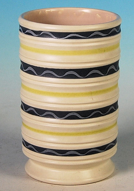
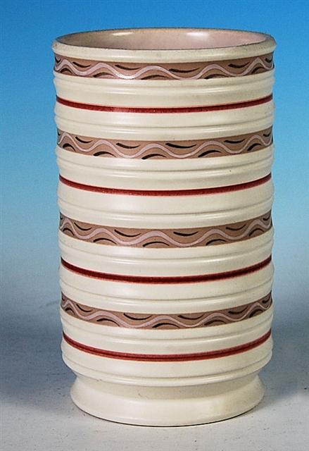
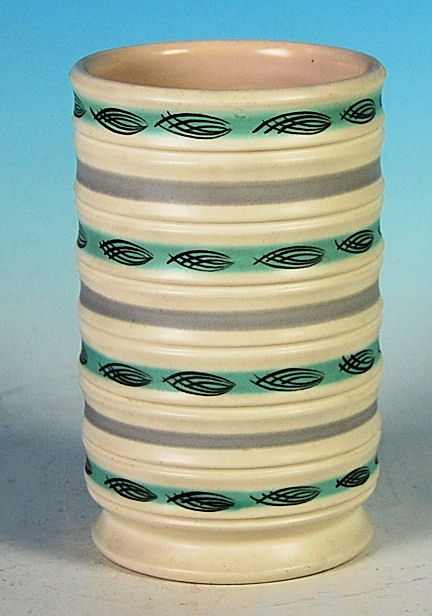
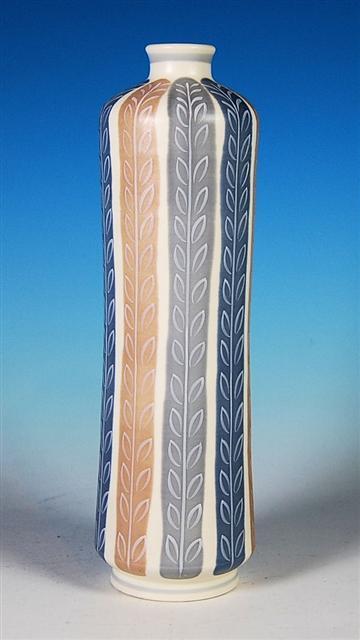
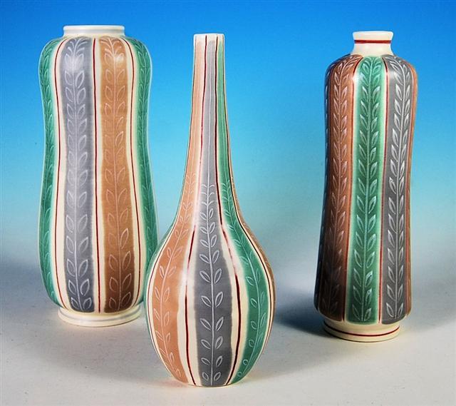
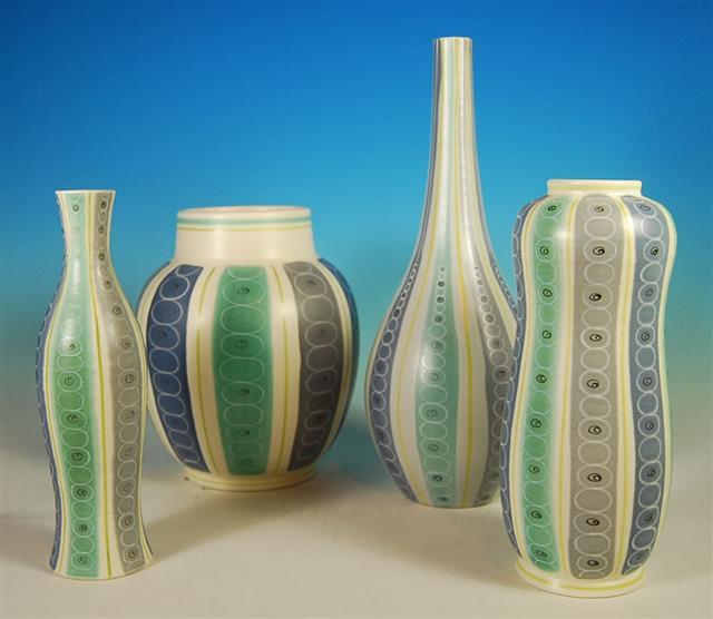
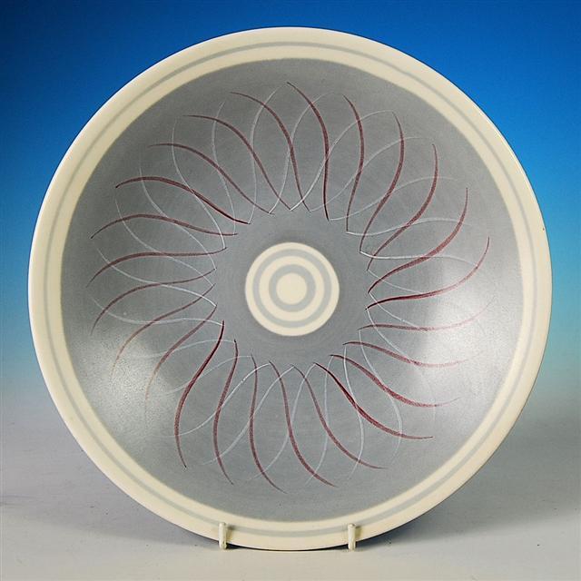
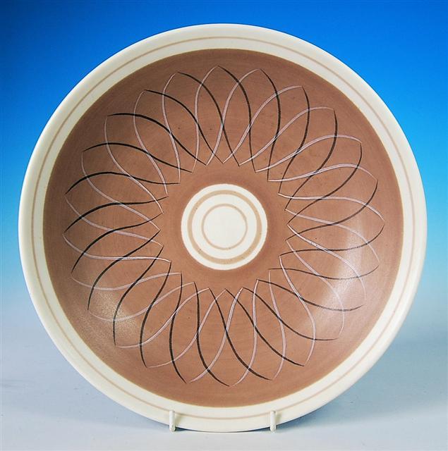
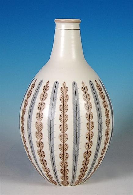
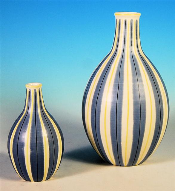
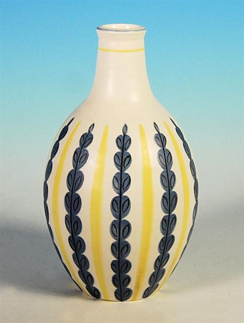
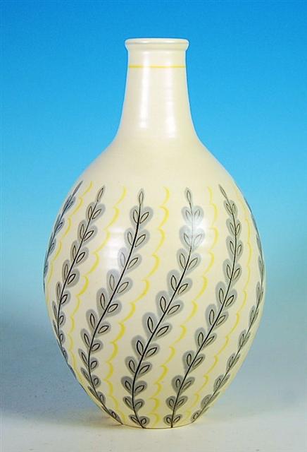
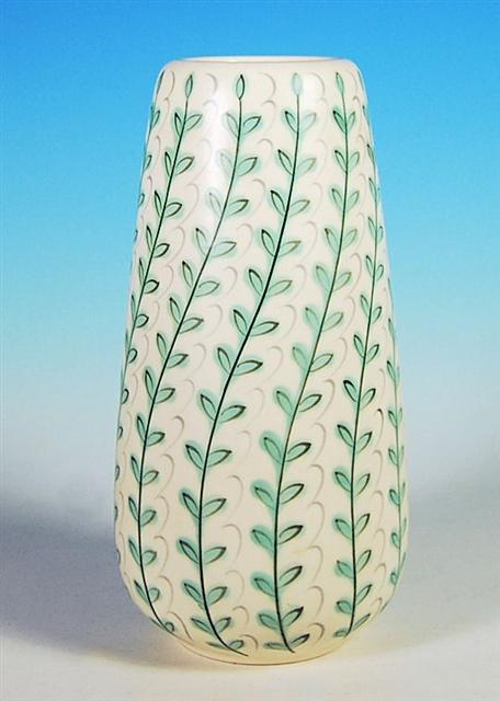
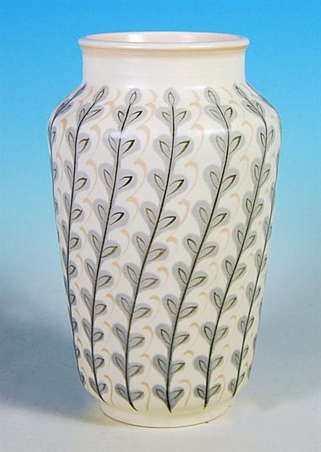
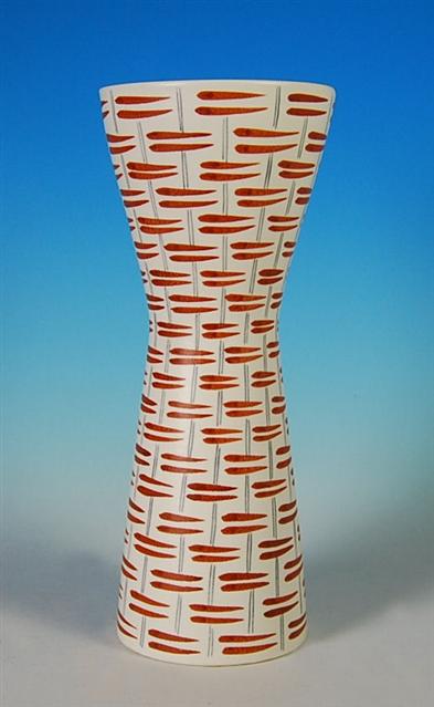
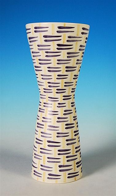
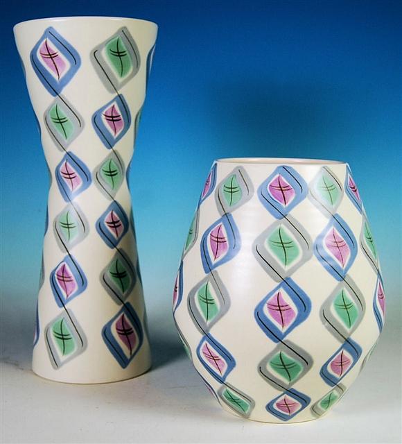
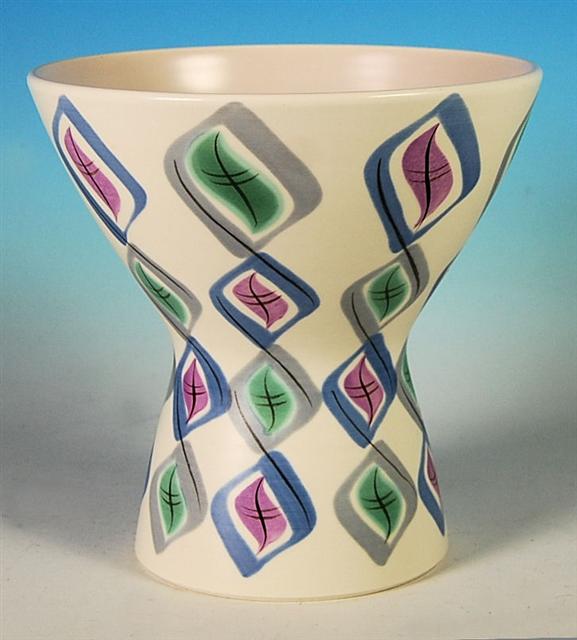
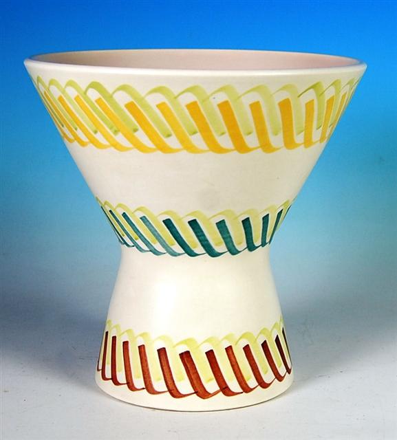
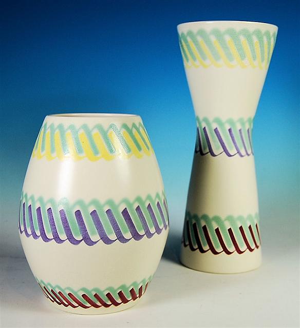
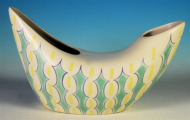
The three pieces shown below are amongst the earliest examples of the decorative style which has become synonymous with 1950's Poole. Made between 1950 and 1951 they pre-date the lifting of wartime restrictions and were probably made for export.
These vases show the distinctive raised bands attributed to the turner Jimmy Soper. The left hand vase is decorated by Gwendoline Selby (1946-1951). All have the impressed Poole Pottery mark rather than the stamped dolphin marks introduced in 1952.
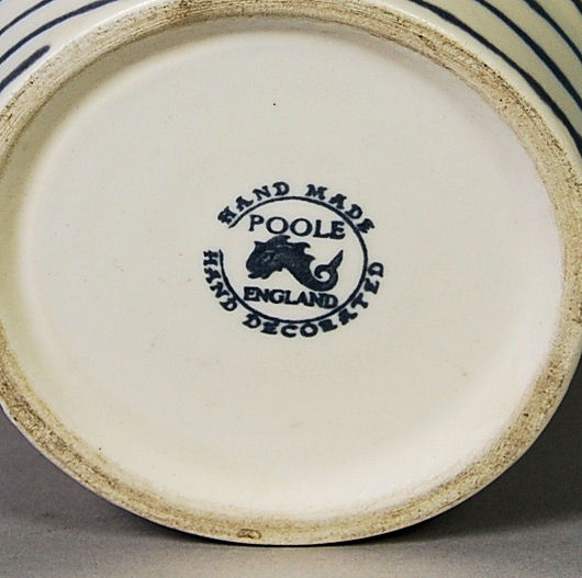
Above - the three 'dolphin' marks most commonly found on 1950's Poole. The left hand and centre marks were used from 1952-1955 and the right hand mark from 1955-1959.
Claude Smale
In 1950 Claude Smale (a former student of the Royal College of Art) joined the Pottery as Head of Design with Ruth Pavely as assistant. Although his tenure lasted for only 6 months, Claude Smale is credited with the designs for a range of Festival of Britain souvenirs and a number of contemporary shapes which became part of the mainstay of 1950's production.
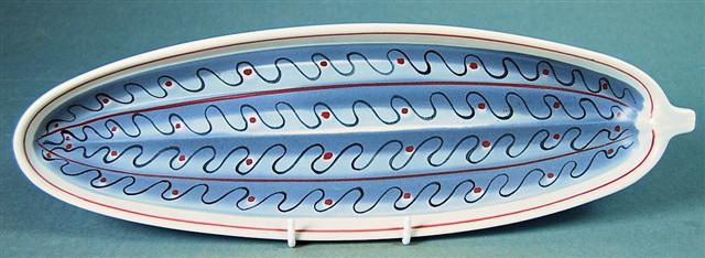
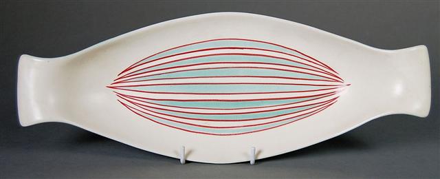
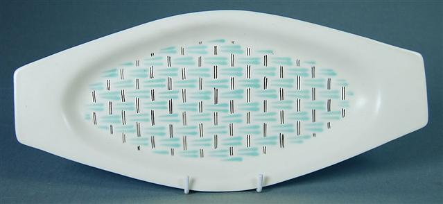
The Festival of Britain was held on the South Bank in London in 1951. Four paintresses gave a permanent demonstration at the Festival as the Pottery embraced the first opportunity in more than a decade to exhibit its work. Souvenir items such as this hors d'oeuvres dish are scarce because of difficulties arranging a Board of Trade licence to sell decorative goods while post-war restrictions remained in place.
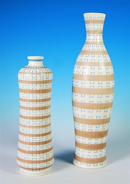
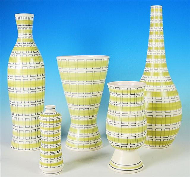
Above - Carafes made in 4 sizes, designed by Claude Smale.
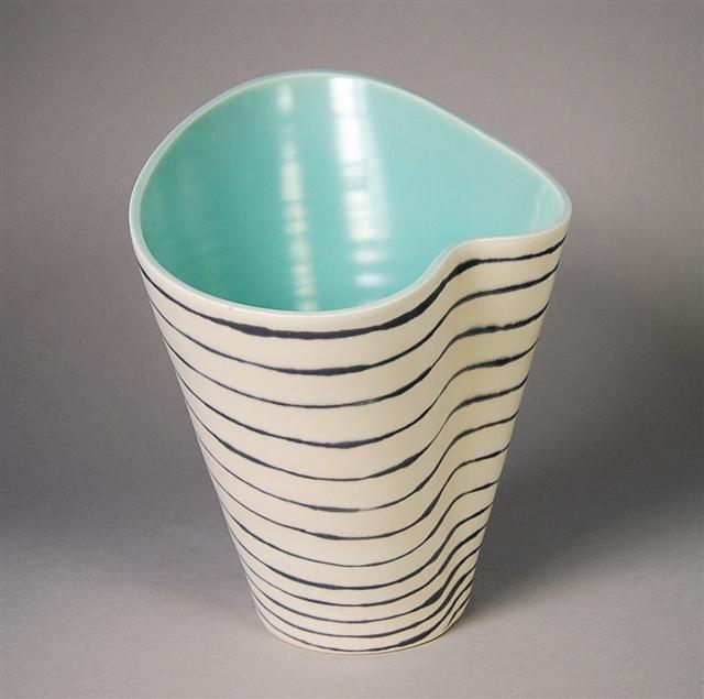
Above - Vase in pattern YHP painted by Jean Cockram, 1953-1955. This is one of several vase designs with inverted rims attributed to Claude Smale.
Alfred Burgess Read
Claude Smale’s replacement was Alfred Burgess Read. He had studied at the Royal College of Art where Harold Stabler lectured from1912 to 1926. This was a time when many students from the College visited the factory and in 1923 he had contributed some kitchen tile designs which later went into production. Although his expertise was in lighting, he was above all a successful and accomplished designer who held the accolade of Royal Designer for Industry. A.B.Read was appointed to the vacant design post in 1951.
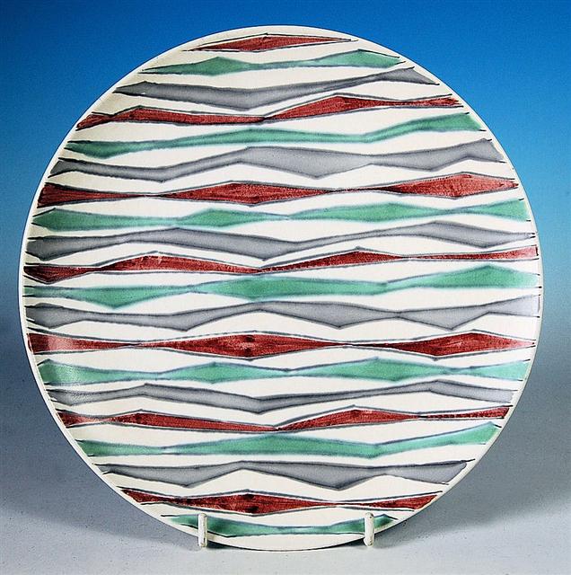
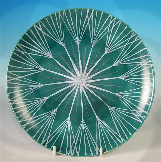
Above - named patterns on contemporary vases kitchen and tableware attributed to A.B.Read include (from left to right) ‘Featherdrift’ (NN), ‘Ariadne’ (OS), ‘Constellation’ (JPG) and ‘Ripple’ (OV) (images not to scale).
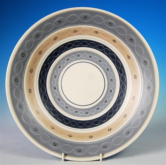
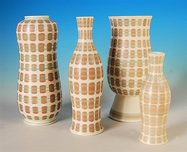
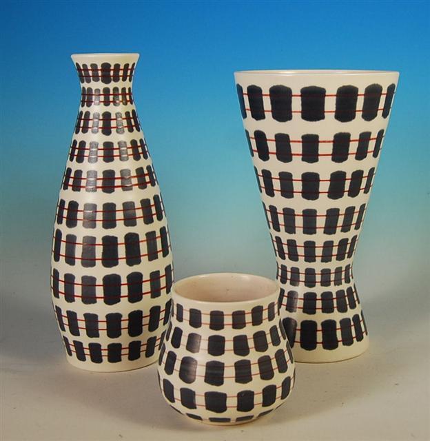
Other patterns are known simply by their pattern code...
Above left - pattern PGS Right - pattern PGT
Above left - pattern PJB Right - pattern PJL
Above - pattern PKC
Above - pattern PKT
Above - patterns PLT (left) and PLC
Above - patterns PQB and PQC
Above - patterns PRP and PRB
Above - pattern PRB
Above - pattern YBC
Above - patterns YAS and YCB
Above - pattern YCS
Above - patterns YFI and YES
Above - patterns YMB and YMP
Above - patterns YFT and YFC
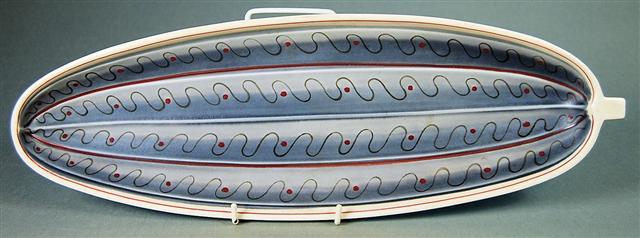
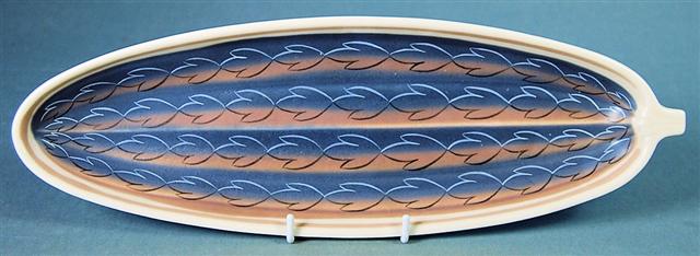
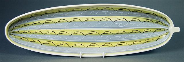
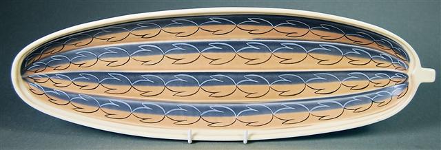
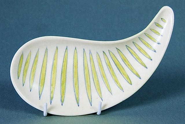
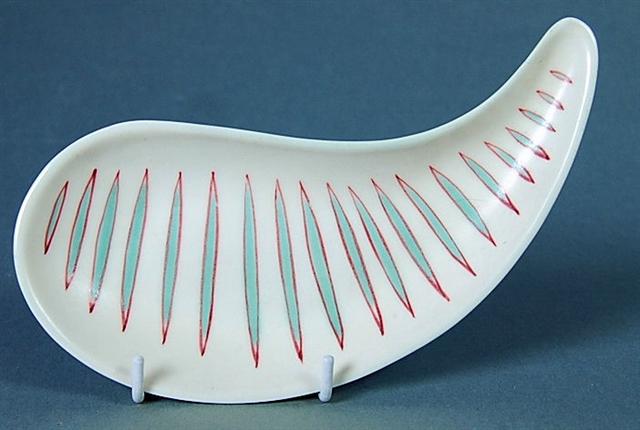
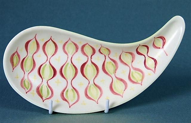
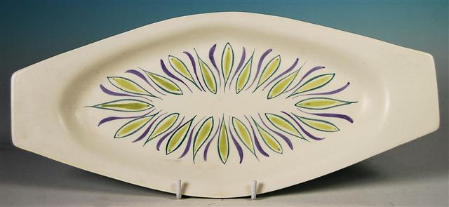
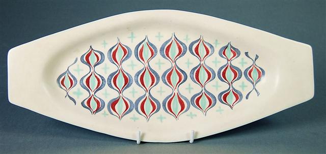
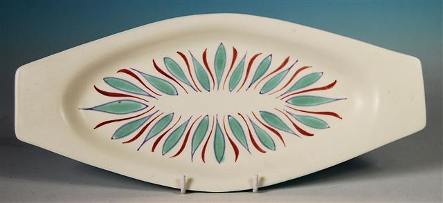
Above - cucumber dishes shapes 145 and 555 (not to scale) in a John Adams design from the mid-1930's but well suited to the contemporary designs of A.B.Read and Ruth Pavely. Patterns (from top to bottom ) TNC, ROC, ROL, ROC (variation), TNC (variation) and unmarked.
The new contemporary shapes were also decorated with fruit and flower motifs designed by Truda Carter for tableware in the 1930's but redrawn with a more modern feel in the 1950's. These designs became known as 'Trudiana' after their designer.
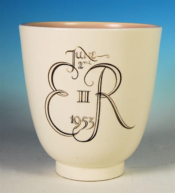
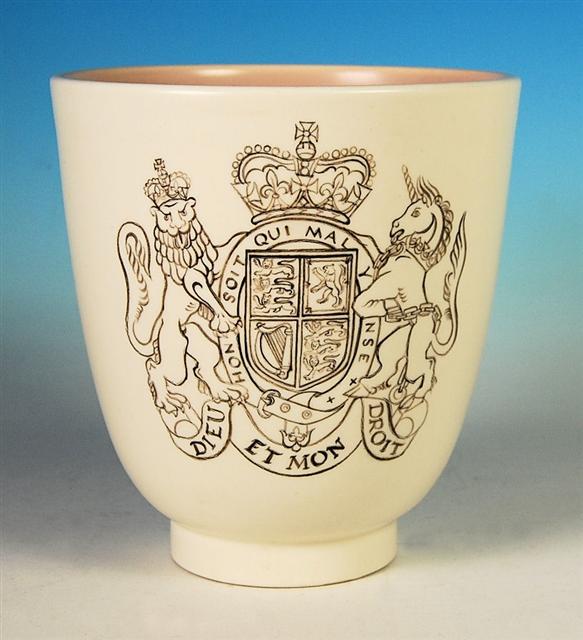
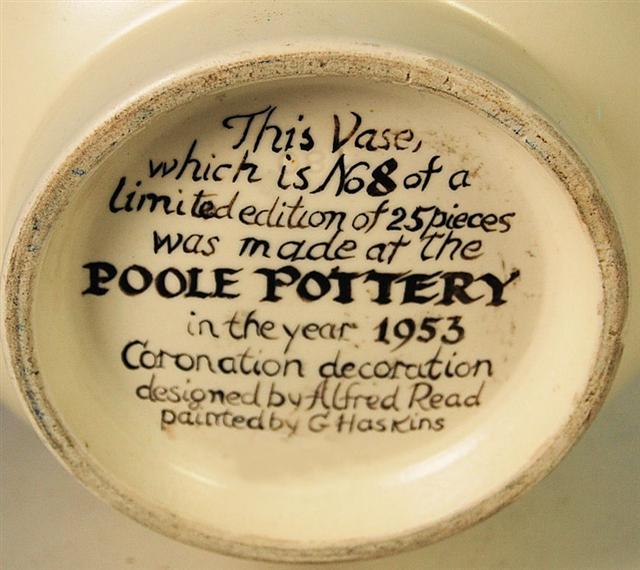
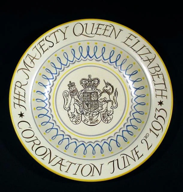
A.B.Read designed the commemorative ware for the coronation of Her Majesty the Queen on 2nd June 1953.
Above - shape 528 shallow bowl in an Alpine White Glaze, decorated by Ruth Pavely.
Ann Read
Alfred Read’s daughter Ann joined the Pottery in 1952. She had studied fine art at Chelsea School of Art but had no experience of ceramics and was taught the art of painting on to unfired glaze by Ruth Pavely [The Poole Potteries by Jennifer Hawkins, 1980]. Ann Read became part of the design team which included A.B.Read, Guy Sydenham and Ruth Pavely.
Above - trial pieces attributed to Ann Read.
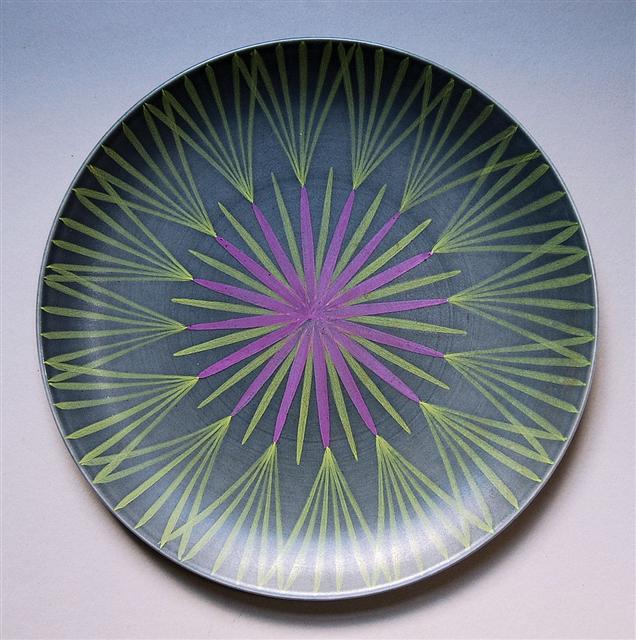
Ann Read is best known for some original designs which were produced in small quantities and sold as limited editions.
Above - plaque named ‘the Quay, Poole - 1' signed by Ann Read. This original design was incorporated into a range of circular plates renamed ‘VZ Poole Harbour’.
Above - plaque named 'Gothic 1' signed by Ann Read.
Above - display plaque designed by Ann Read (c.1956) and painted by Nellie Blackmore who was the painting shop supervisor from 1950-1976 and whose career at Poole Pottery began in 1927.
Above - plaque named 'Leo A1' signed by Ann Read.
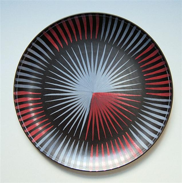
Above - plaque named 'Rock Crystal' and signed by Ann Read. This was one of a series of plaques and plates with coloured decoration set against a black ground.
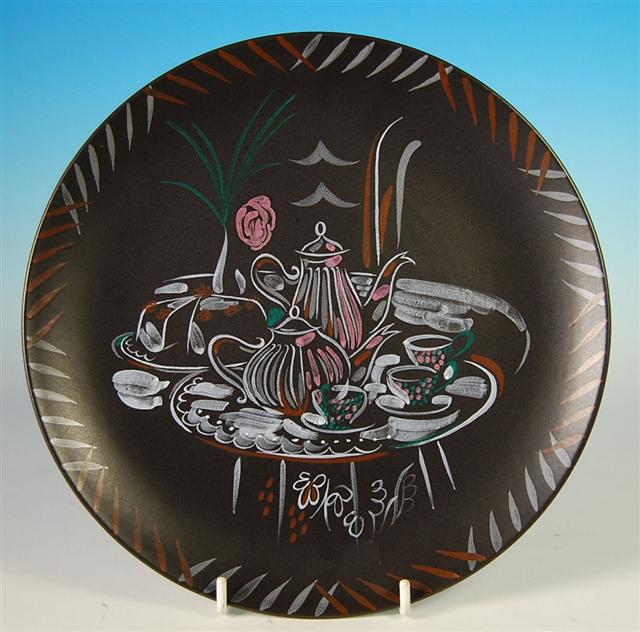
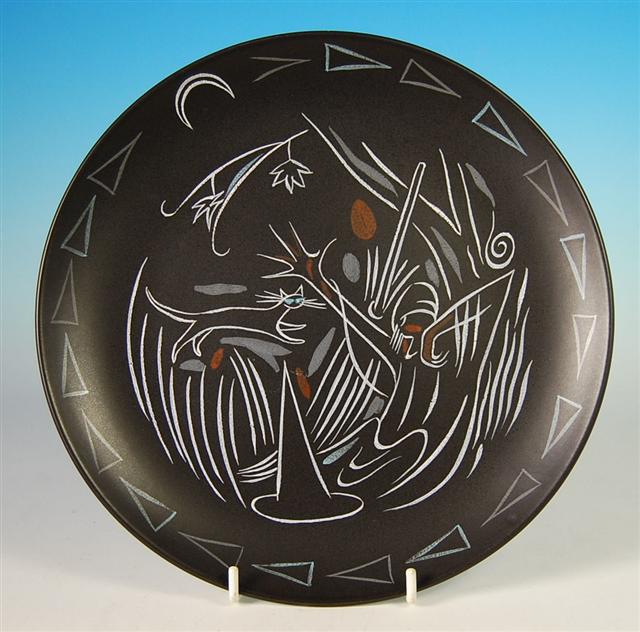
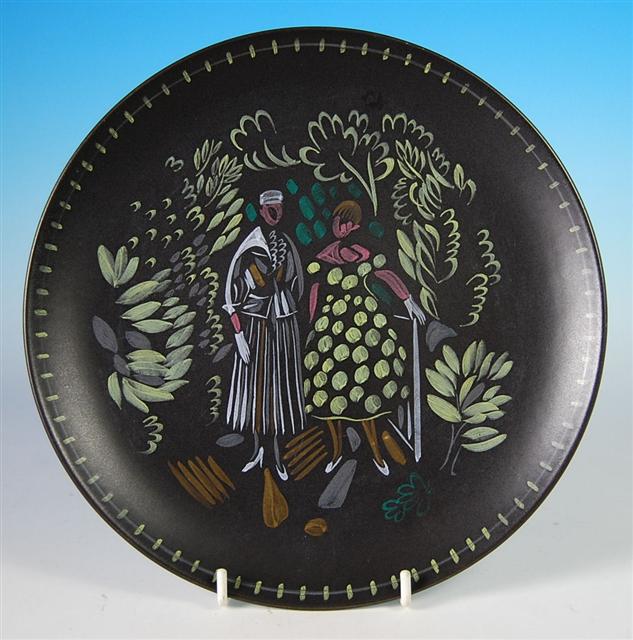
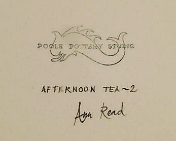
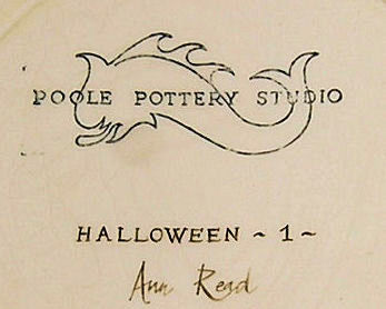
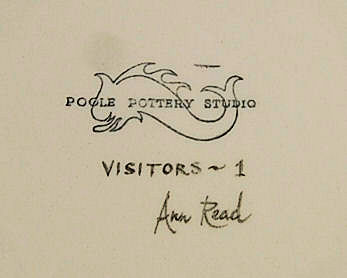
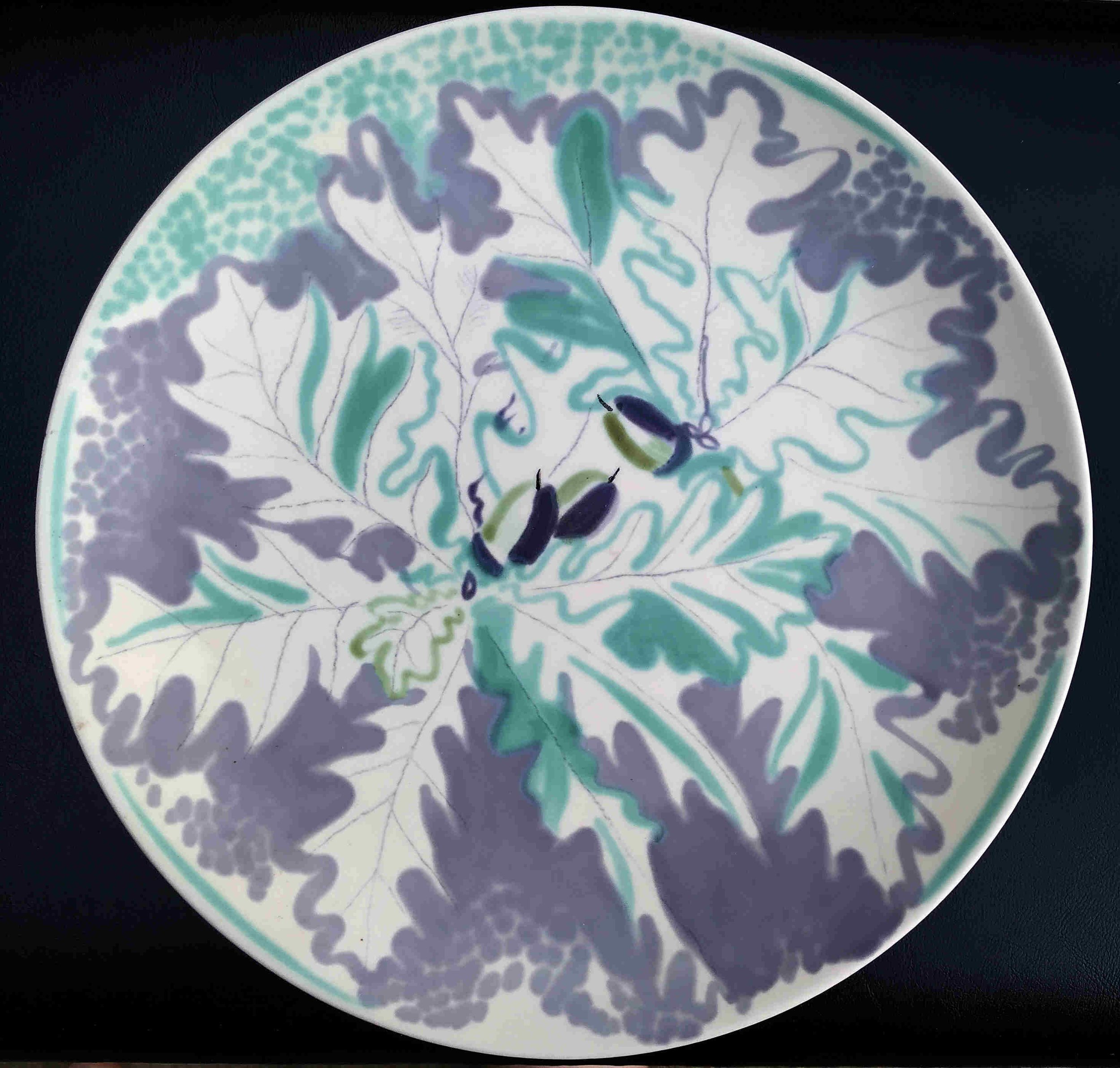
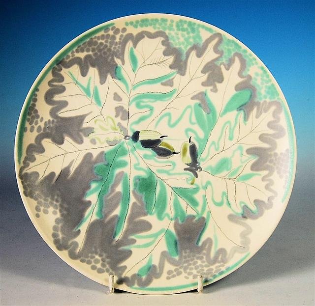
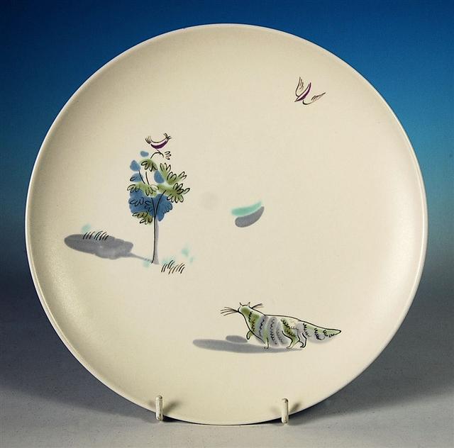
Above - 'Afternoon Tea 2', 'Halloween 1' and 'Visitors 1'. Most of Ann Read's plates show a unique Poole Pottery Studio mark, the design name and the designer's signature.
Above - 'Shadow play 1’ and ‘Shadow Play 3’
Above - 'Papyrus A-2' and Midnight Sun-2'
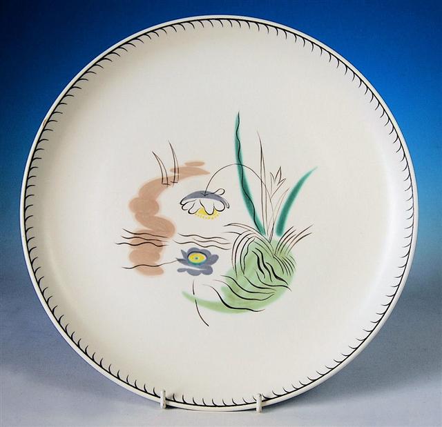
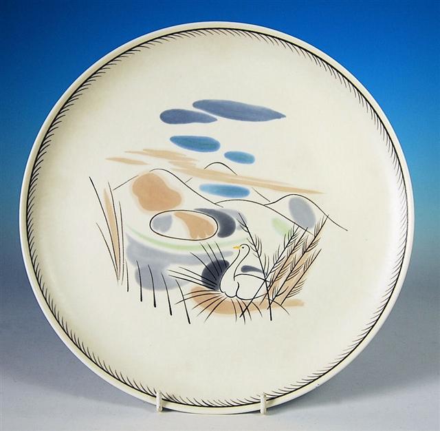
Above - top left to bottom right - unsigned plate, Ann Read paintress mark 'R' dated 20.4.1955, pattern AW, pattern UG snow goose and 'the 8.45 - 3'. All have the factory dolphin mark for 1955-1959 except for 'the 8.45' which has Ann Read's distinctive Poole Studio dolphin mark.
Freeform
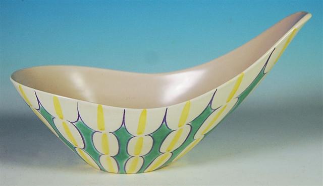
Freeform is the name given to the Scandinavian-influenced asymmetrical and elliptical shaped vases conceived in the early 1950's and produced from 1956. A.B.Read is credited with the initial design in conjunction with Guy Sydenham. The design policy at this time involved close co-operation between designer, thrower and artist. Painted designs by Ann Read and Ruth Pavely were informal and well adapted to the irregular curved surfaces of the freeform range. The vases were very popular for flower arranging (which was a popular pastime) and in the words of Guy Sydenham, ‘we couldn’t make enough of them’ [A Potter’s Life II].
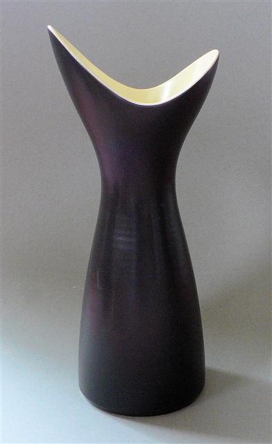
Shape 724 vases in Black Panther and Magnolia White glazes. Arguably, the pure, organic shapes look their best in plain colours without decoration. [it seems that Guy Sydenham held a similar view - see 'A Potter's Life' pp 105]
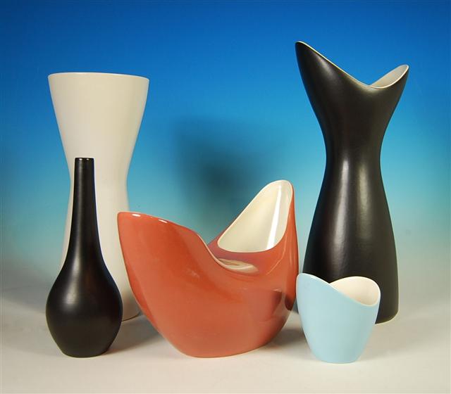
Above - from left to right, shape 724, shape 696, shape 342, unrecorded bowl thrown and signed by Guy Sydenham and shape 719 all in Black Panther glaze.
Above - from near left to right, shape 696, shape 719 in Magnolia White, shape 343 in Red Indian, shape 350 in sky blue and shape 724.
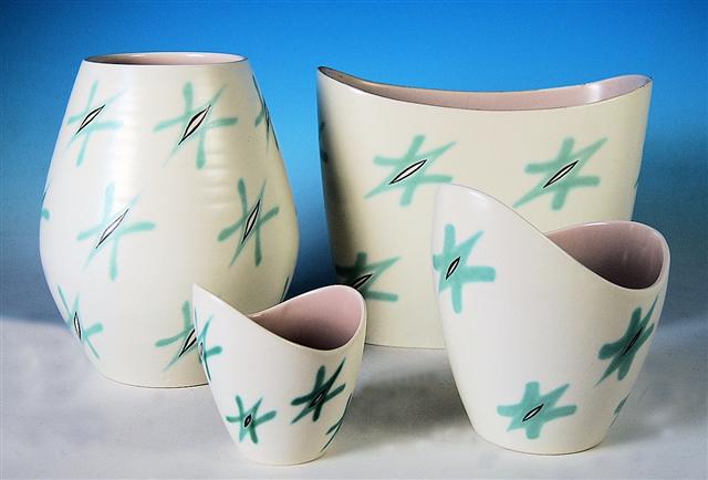
Above - Stars pattern FST and FSU designed by Ruth Pavely, 1956-1957. From left to right shapes 716, 350, 342, 351, 342 and 343.
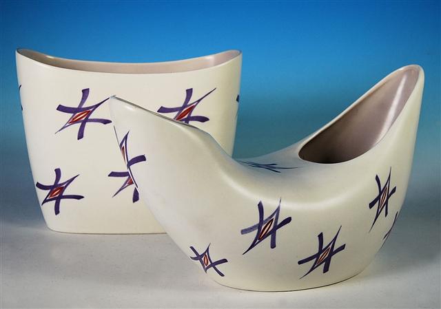
Above - pattern FST shapes 343, 342 and 742.
Above - shape 719 in Basket pattern GBA and GBU designed by Ann Read.
Above - Basket pattern in unusual and unrecorded colours, probably a trial.
Above - Ravioli pattern GGP shapes 723, 721 and 716.
Above - Harlequin pattern HOL and HOU by Ruth Pavely.
Above - Horizontal Rope pattern HYL and HYT by Ruth Pavely 1956-1957, shapes 725, 716 and 719.
Above - Red Scrolls pattern HZT by Ruth Pavely 1956-1957, shapes 722, 718, 725, 716 and 721.
Above - Yellow Scrolls pattern HZU by Ruth Pavely 1956-1957, shapes 717, 723, 722 and 180.
Above - Bamboo pattern PS designed by Ann Read, shapes 343 and 356.
Above - Bamboo pattern shapes (from near left to right), 350, 324, 720, 342 and 351.
bove - shape 302 showing different interpretations of the Bamboo pattern. The recorded pattern sheets were closely followed by the paintresses and variants of the standard patterns are unusual.
Above - Butterflies pattern PT designed by Ruth Pavely, 1956-1957. Shapes 343 and 720.
Above - Burst pattern PV designed by Ruth Pavely, 1956-1957. Shapes 350, 352, 742, 343 and 720.
Above - Loops pattern PW designed by Ruth Pavely, 1956-1957. Shapes 350, 351, 352, 742, 343 and 720.
Above - Tadpoles pattern PX designed by Ruth Pavely, 1956-1957, shapes 343 and 742.
Above - Totem pattern PY designed by Ruth Pavely, 1956-1957, shapes 343, 350 and 742.
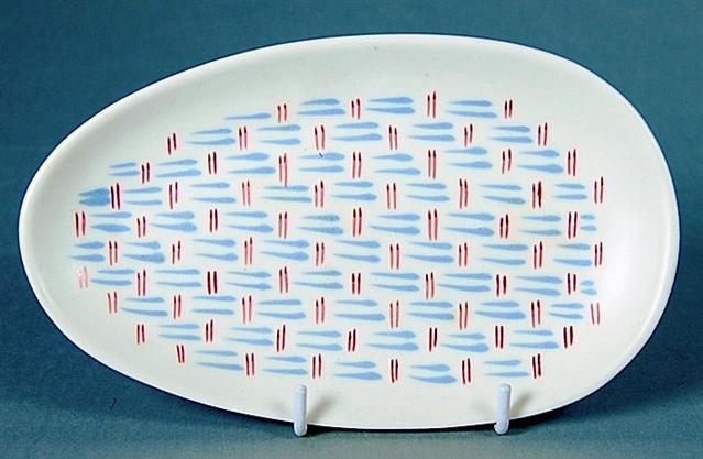
Above - a selection of small dishes (from top to bottom) shape 358 patterns GGU, UFT and UIT.
Above - shape 359 patterns UIL, UIT and UOL,
Above - shape 365 patterns UFW, UOT and UFT
Above - shape 360 pattern GBG and shape 365 pattern GBT.
Trials and one-offs
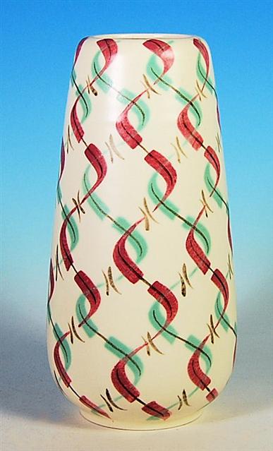
Trial patterns and one-off designs are rare.
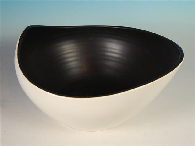
Above - an early and important prototype freeform bowl designed and hand thrown by Guy Sydenham, 1958. The vase is illustrated in Guy's second book 'A Potter's Life II'.
Above - a rare white earthenware vase thrown on the wheel by Guy Sydenham, painted on Alpine White glaze by Ruth Pavely, 1953. The vase can just be made out (on a shelf above Lucien Myers) in the 1954 design meeting photograph illustrated in Hayward and Atterbury at page 99.
Above - 'one-off' vase shape 724 by Guy Sydenham. The shape was designed for slip casting but this example is hand-thrown. Presentation pieces were usually produced in pairs and an identical vase was presented to the actress Eva Bartok at a Tea Centre exhibition in 1958.
Freeform designs by Guy Sydenham. The rear left hand vase shape 724 is the only 'production' piece.
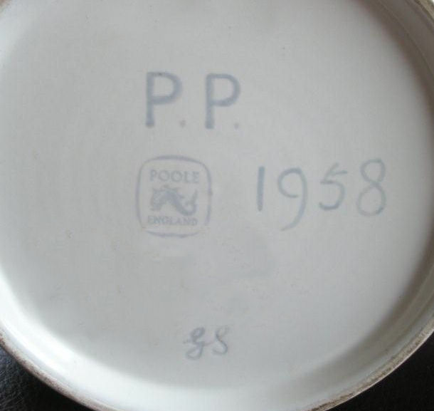
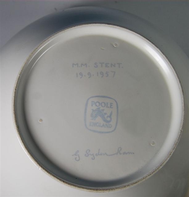
Bowl in a unique shape, signed and dated, 1957.
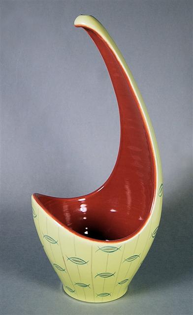
Above - freeform hanging planter, Guy Sydenham, 1950's
Above left - a rare free form experimental hanging planter, 16 inches high - centre glazed in Red Indian, outer in a trial pattern (not produced). Right - studio vase in a trial pattern beneath a Red Indian glaze. Both pieces were exhibited in the display of studio pottery at the Tea Centre Regent Street in January 1958 and can be seen in the Exhibition Catalogue ‘Poole in the 1950's' on page 6.
Above - a large (15 inch) one-off vase painted by Ruth Pavely on a Black Panther glaze in about 1954. This piece was also part of the display for the Tea Centre Exhibition and can be seen in the photograph referred to above.
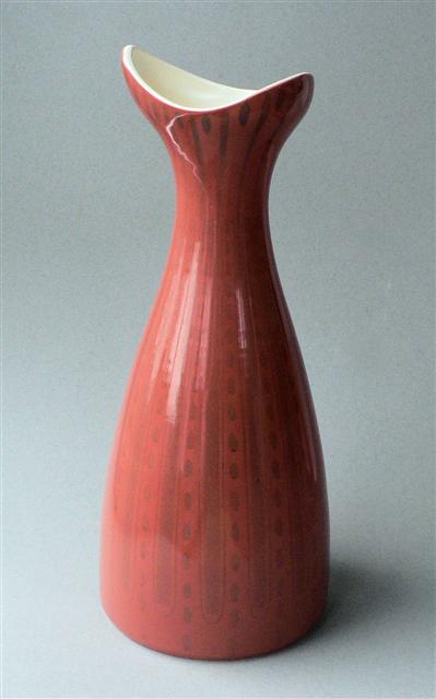
Carafe designed by Claude Smale in an unrecorded pattern, 1952-1955.
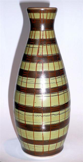
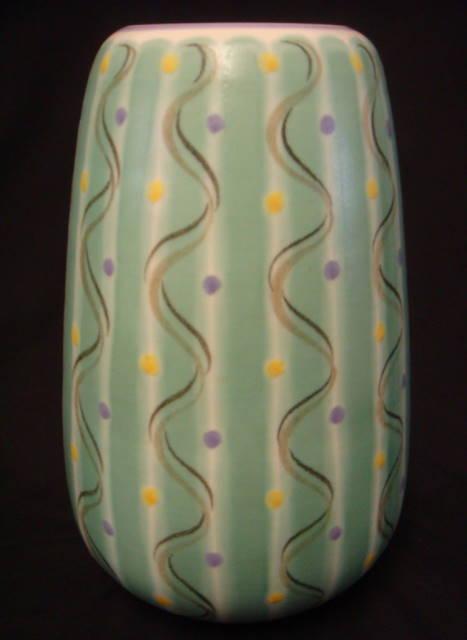
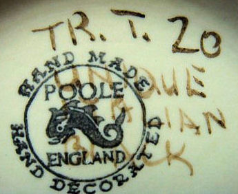
Above left - PJL pattern on a brown glazed vase. The Lime green bands have not adhered well to the underlying glaze and this may explain why the pattern was not put into production. Right - shape 685 designed by Claude Smale in an unrecorded pattern, 1952-1955. The trial markings read 'TR.T.20 Unique Italian Black'.
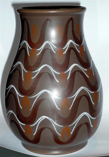
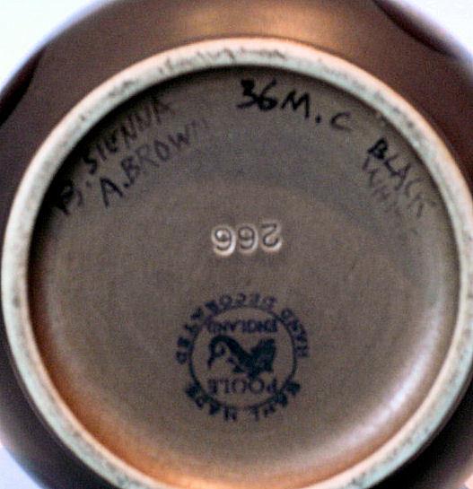
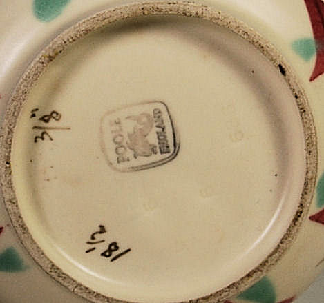
Above - an unrecorded pattern on a brown glaze, 1952-1955. The markings on the base are believed to denote the sequence in which the colours were applied and the time taken (36 minutes) to decorate (for the purpose of costing). Similar numbers appear on some of the pieces shown below.
Above - shape 313 flower trough in an unrecorded trial pattern
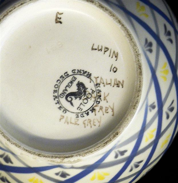
Above - shape 685 vase in an unrecorded pattern showing trial markings to the base.
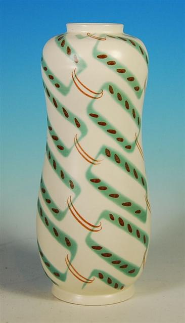
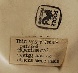
Above - shape 700 vase. The factory label to the base confirms the experimental design.
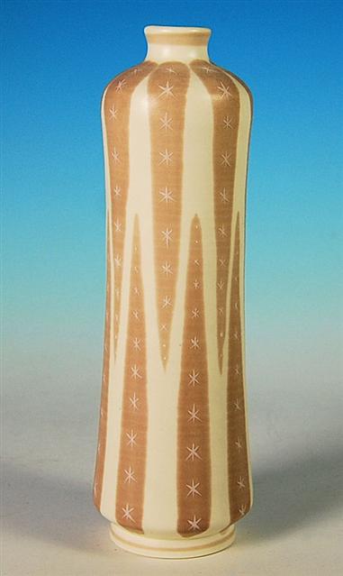
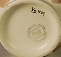
Above - shape 707 in an unrecorded trial pattern, 1952-1955. The manuscript mark may indicate the time taken to decorate (see above).
Above L and R - unrecorded trial pattern shape 710, 1952-1955. Centre - unrecorded trial pattern 1955-1959.
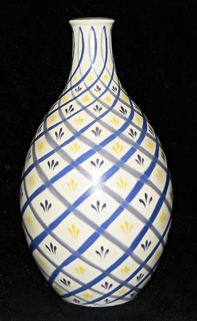
Above - unrecorded trial pattern.


